

SOCIAL PAIGE
MARKETING
bRAND design
Brand design for Social Paige Marketing, a marketing company centered on helping their clients build real and genuine connections with their respective audiences.
Who is social paige marketing?
Social Paige Marketing isn’t your average marketing firm. Instead, they’re a personality-packed brand that helps their clients reach their ultimate goal: Creating connections with their communities. We aimed to make this brand meet four visual guidelines:
Sophisticated: The brand should feel bold and current, but also sophisticated and confident.
Energizing: The brand should make its audience feel empowered and welcome to be a part of the SPM story.
Bold: The brand should embrace its boldness and stand out from competitors through the use of design.
Magnetic: The brand should feel magnetic with daring design. It should make the user want to see more.
We did just that.


PROBLEM
The
Paige had spent countless hours trying to DIY her brand, only feeling frustrated when nothing stuck. She knew she wanted something bold and fun, but she wasn’t sure how to achieve that while also creating something that felt sophisticated and professional.

SOLUTION
The
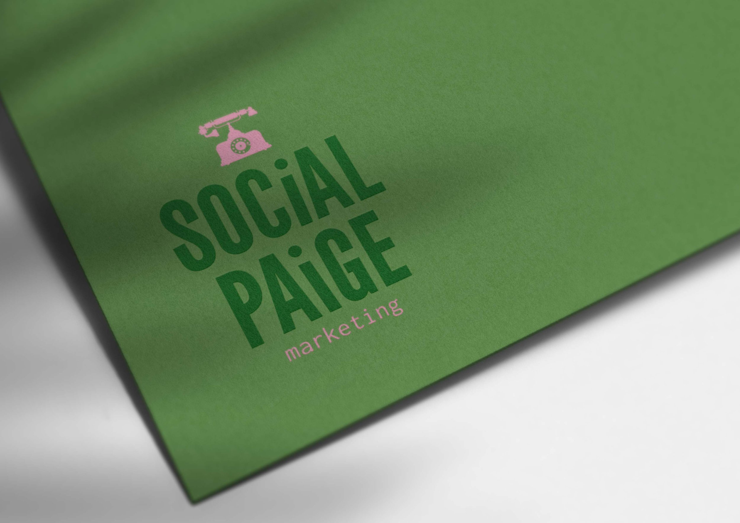
By pairing shades of pink with bolder shades of purple and teal, we achieved a look that feels intentional and personality-packed. It’s a balanced brand aimed to target any type of small business. We also utilized a strong sans serif as the main brand font to help Social Paige Marketing show up with authority.


Website design
This website design features tons of personality, brand badges, patterns, and icons.


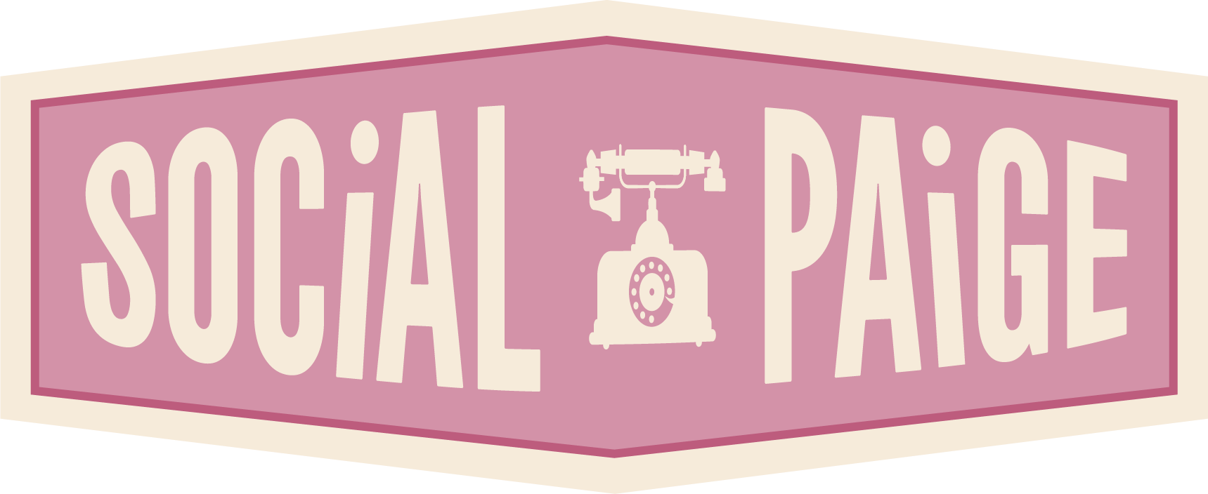
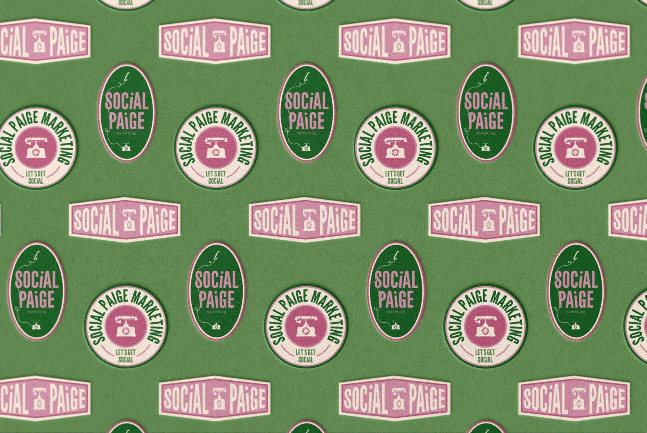
Brand PATTERNS


next up:
MARGARITA MONDAYS
Brand Design
Conceptual branding for a design studio who focuses on enjoying every day, even the Mondays.